
More Painting
An accomplishment.
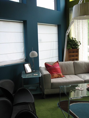
The other acre of wall wears color!
Welcome Benjamin Moore Naples Blue. It's growing on me, particularly since I've completed the upstairs media room part.
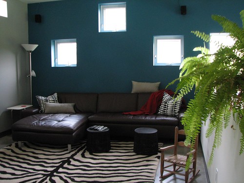
At first I thought it was too dark, and I still do think it's a bit dark for the living room at night, but I love it so much in the media room that that makes up for my uncertainty about the downstairs quite a bit.
My current plan is to concoct some kind of lighting or light sculpture for the big part of the wall that is without windows. Since this spot kind of needs art anyway and is the biggest offender in the "too dark" category, I think lighting, possibly along with some great (big) art, will be the perfect solution.
I'll add that to my arm-long to do list right away.
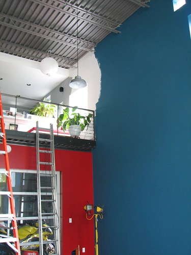
So the part that I'm not loving is where the new blue abuts the red of the bike room wall. I love the red, and I sort of love the blue down there, but together they are sort of making me want to barf, so I'm now considering repainting the red wall something more Naples Blue-friendly. But I really love how the red downstairs ties into the red upstairs in the foyer.
Anyway, the thought of painting over this red makes me want to cry because it took oodles of work to get the up and finished, and I really truly love it. But if it all doesn't work, it'll bug me forever, and I'd sooner change it than the huge wall which I am definitely not repainting anytime soon.
Now if only I could decide on the perfect coffee table and more seating for the media room I could add it to the almost completely finished list.
The other acre of wall wears color!
Welcome Benjamin Moore Naples Blue. It's growing on me, particularly since I've completed the upstairs media room part.
At first I thought it was too dark, and I still do think it's a bit dark for the living room at night, but I love it so much in the media room that that makes up for my uncertainty about the downstairs quite a bit.
My current plan is to concoct some kind of lighting or light sculpture for the big part of the wall that is without windows. Since this spot kind of needs art anyway and is the biggest offender in the "too dark" category, I think lighting, possibly along with some great (big) art, will be the perfect solution.
I'll add that to my arm-long to do list right away.
So the part that I'm not loving is where the new blue abuts the red of the bike room wall. I love the red, and I sort of love the blue down there, but together they are sort of making me want to barf, so I'm now considering repainting the red wall something more Naples Blue-friendly. But I really love how the red downstairs ties into the red upstairs in the foyer.
Anyway, the thought of painting over this red makes me want to cry because it took oodles of work to get the up and finished, and I really truly love it. But if it all doesn't work, it'll bug me forever, and I'd sooner change it than the huge wall which I am definitely not repainting anytime soon.
Now if only I could decide on the perfect coffee table and more seating for the media room I could add it to the almost completely finished list.
posted by splatgirl at 3:36 PM
![]()
![]()

6 Comments:
I love your place - found the blog a couple months ago. So in love with the Naples blue! I have no asethetic training to back up a suggestion, but to resolve the blue/red edge, what about somehow extending the black overhang down the corner where the colours meet as a kind of border? A thin black metal ladder to kind of echo the black metal overhang? Tough one.
I too love the naples blue. it feels fresh and funky and at the same time really grounding.
I think you need art to tie together the blue and the red. Either something huge that has both the colors in small proportions, or possibly even doing a collection of lots of different small frames in a big vertical set to distract the eye from the join of the two colors.
don't lose the red though! it's scintillating.
Yeah, the red & blue is too American flag or something. The blue is amazing. I always like that blue color with brown or asparagus green.
Wow, I love the colours, your pics are very inspiring!
It's all looking great! I'm also a fan of both the red and blue. A black divider of some sort in the corner would separate the colors just enough. Molding, or an extension of the metalwork above (a flat piece on the blue wall that would eliminate that little blue jog just under the railing). You could try it out with black construction paper or posterboard strips before doing anything more permanent or expensive.
i saw yr blog after holly from decor8 featured some pics from it. what a sexy place!! and it just fills me with respect to see the amount of effort and time that went into making it what it is now. ( ya i went through all the archives )And im going to bookmark yr blog- if i need any solutions- you've made the whole project very informative :) thanx :)
about the red & the blue- The right art on either wall can solve the issue, or a piece of corner piece/cabinet/plant. hey, i have an idea! why dont you hang pretty lights in that corner & turn your predicament into a focal point. the way the light falls will create interesting patterns on both walls & make the different colours show up in their own splendour.
Post a Comment
<< Home