Cubby Completion
At long last.
After a few weeks' delay, I finally found time to take up the paint roller again and finish up with the foyer cubby project:

It would have been finished sooner, but I had originally painted the inside orange, and, after four painstaking coats, decided I didn't like it and went back to clean, gallery white which took another three coats. Truthfully, I'm still not super in love with it in white, but I think it provides a nice backdrop for what's in there and whatever I may decide to display in the future. It's still missing something for me, though, so if I get some time during the week I may experiment a bit with hanging some fabric panels. And if I'm feeling extra ambitious someday, I'm going to try a dark charcoal/blackish paint or a rasterbated image in there. (Now that I look at it in pictures, I really don't like it white at all so that may happen sooner than later.) So the only remaining detail is to treat the "floor" with something more durable than paint on sheetrock, probably either black VCT or large format tiles.
Anyway.
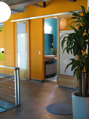
The slight fiasco with the orange cubby was the result of a previously completed but as yet unrevealed decision to go out on another orange limb for the upstairs bath/guest room wall:

Like most things in this house, it's nice to have it actually painted, but I'm not sure I love it. Since it was so dang much work, those four coats and all, I'm forcing myself to live with it for a while, but I suspect that eventually it will succumb to the Naples Blue of the foyer, et. al.
There are a few select views where I think it looks great, but my overall feeling is that it's looking just a bit too circus-ey for my taste, like a color wheel vomited, particularly when seen in context with the red (since it's a holiday and you're probably relaxing, I am going to refrain from scaring you with that view right this second).
Sigh.
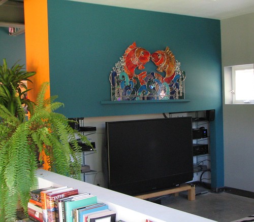
And speaking of Naples Blue, (I never thought I'd be so embracing of such a color), it's also making an appearance in the media room, where my most loved stained glass panel is now safely and soundly installed, rescued from it's three years in storage in perfect shape. Of everything we packed up, moved and stored from our old house way back when, it's THE thing that completely stressed me out so it's a huge relief to have it back and properly displayed:

And yes, the TV cubby could use being painted a charcoal/black and tidied up a bit, but there are just not words to describe how much I hate screwing around with electronic equipment and the cord jungle that goes with it so that's just going to have to wait...
After a few weeks' delay, I finally found time to take up the paint roller again and finish up with the foyer cubby project:

It would have been finished sooner, but I had originally painted the inside orange, and, after four painstaking coats, decided I didn't like it and went back to clean, gallery white which took another three coats. Truthfully, I'm still not super in love with it in white, but I think it provides a nice backdrop for what's in there and whatever I may decide to display in the future. It's still missing something for me, though, so if I get some time during the week I may experiment a bit with hanging some fabric panels. And if I'm feeling extra ambitious someday, I'm going to try a dark charcoal/blackish paint or a rasterbated image in there. (Now that I look at it in pictures, I really don't like it white at all so that may happen sooner than later.) So the only remaining detail is to treat the "floor" with something more durable than paint on sheetrock, probably either black VCT or large format tiles.
Anyway.
The slight fiasco with the orange cubby was the result of a previously completed but as yet unrevealed decision to go out on another orange limb for the upstairs bath/guest room wall:

Like most things in this house, it's nice to have it actually painted, but I'm not sure I love it. Since it was so dang much work, those four coats and all, I'm forcing myself to live with it for a while, but I suspect that eventually it will succumb to the Naples Blue of the foyer, et. al.
There are a few select views where I think it looks great, but my overall feeling is that it's looking just a bit too circus-ey for my taste, like a color wheel vomited, particularly when seen in context with the red (since it's a holiday and you're probably relaxing, I am going to refrain from scaring you with that view right this second).
Sigh.
And speaking of Naples Blue, (I never thought I'd be so embracing of such a color), it's also making an appearance in the media room, where my most loved stained glass panel is now safely and soundly installed, rescued from it's three years in storage in perfect shape. Of everything we packed up, moved and stored from our old house way back when, it's THE thing that completely stressed me out so it's a huge relief to have it back and properly displayed:

And yes, the TV cubby could use being painted a charcoal/black and tidied up a bit, but there are just not words to describe how much I hate screwing around with electronic equipment and the cord jungle that goes with it so that's just going to have to wait...


8 Comments:
I Love the orange in the image with your incredible piece of art glass.
I agree the foyer needs a touch of something...but haven't a clue.
Great work! Love your space.
Hey SG,
One more day til the big article! I'll be looking out for it.
I wanted to ask you what kind of hardware you used for your sliding doors to to the bathroom. Was it tricky to install? It looks pretty straightforward. How did you find doors that were compatible?
Yo art and chel! If you go to johnsonhardware.com, it's their wall mounted sliding door hardware, or just google that and you'd probably find a number of vendors of the same kind of thing.
It's basically just an extruded aluminium track that screws to the wall (into studs, of course) and some rollers that attach to the top of the door. Not hard at all to install, and works with pretty much any door or door shaped thing. Mine are recycled 8' storefront doors that were originally hinged/swinging.
Thanks a bunch!
Hi! I love your blog, your writing just cracks me up and I love watching your home evolve. I do hope you enter the AT color contest. You have my vote.
I was a little skeptical about the cubby - but think it turned out great. I like it white - especially with the lighting. And I love, love, love the parking meter and fire truck to complete the display. I'm kind of intrigued by the idea of a rasterbated image. I even have a couple in mind - maybe I'll send you an email. I'd do a black and white or sepia toned one.
Also - I really love the orange. You might get used to it.
Thanks for sharing.
Thanks Peggy!
I think I am too lazy to enter the AT thing. And I couldn't decide WHAT to enter being that it's like a color wheel on crack in here...but thanks for the vote anyway :)
Still no further progress on the cubby but the more I think about some kind of image, the more I'm thinking it's the right plan.
I just found your blog and I'm in llove. You're more interesing than Apartment Therapy, and with none of the obnoxious condescending snobs! I'll definitely be following you in the future.
Do you recall the paint you used for the orange in the above photo?
Hi b
It's Benjamin Moore Orange Sky I think.
Thanks for reading!
Post a Comment
<< Home